
New Component - Waffle & Icon-Array Charts
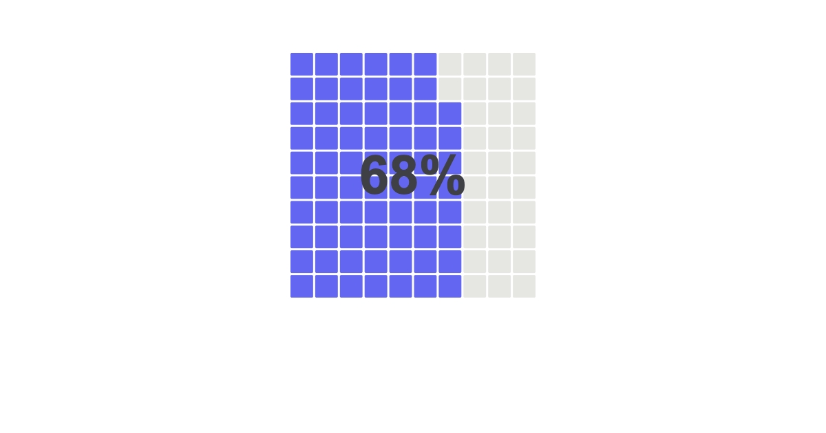

New component waffleNew Component: Waffle
Pie charts get hard to read the moment slices get small. Waffle charts fix that. It's a grid of unit cells where the filled count is the proportion, so it reads instantly, even on a phone-sized card.
Two ways to feed itTwo ways to feed it
Give it a single value (0 to 100) for a clean "68% used" tile. Or pass an array of data values plus labels for a multi-category breakdown that fills the same grid in order. The grid auto-sizes to your box.
Square or dotsSquare or dots
shape: "square" gives you the classic waffle block. shape: "circle" turns it into a dot icon-array, the "X out of 100" look that's great for survey results and adoption stats. Colors, gaps, and cell count are all yours.
Dynamic data per renderDynamic data, per render
Mark it dynamic and push a fresh number on every render:
POST https://render.imejis.io/v1/<design-id>
{ "usage.value": 68 }
Storage-used tiles, feature-adoption cards, "9 in 10 customers" social graphics. One template, one JSON body.
Try itTry it
It's in the editor palette under Data, and the waffle component page has a live playground with every property and the exact API request that reproduces your edits.