
New Component - Treemap & Market Heatmaps
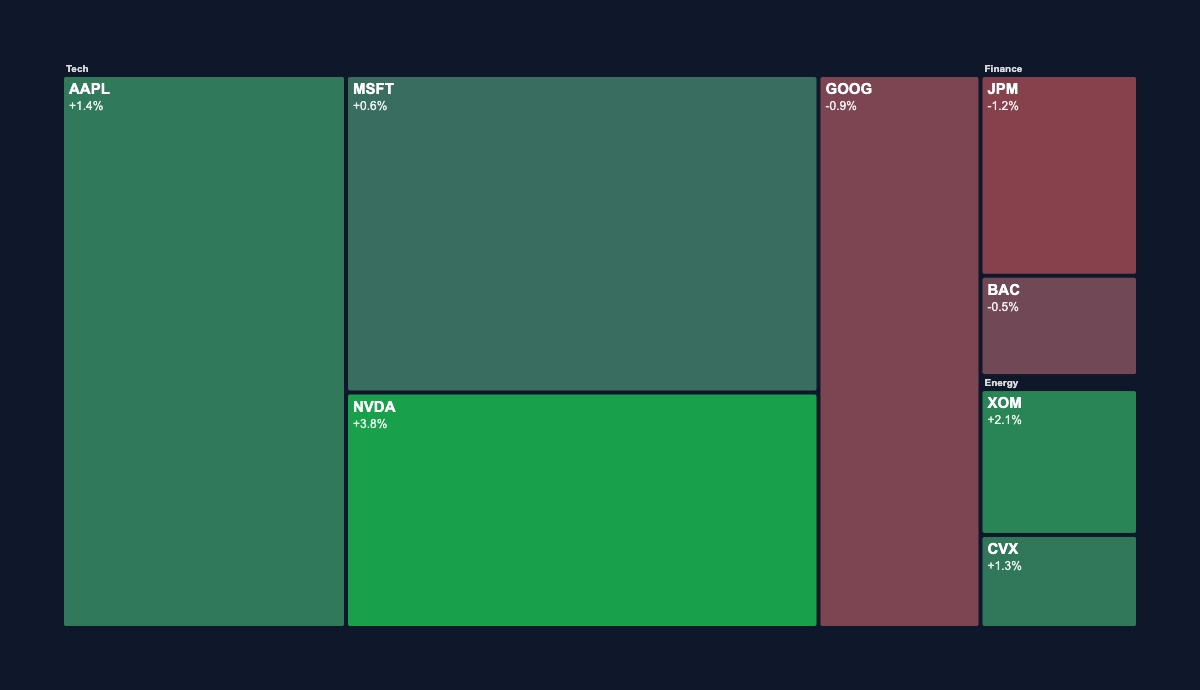

New component treemapNew Component: Treemap
You know the market map from Finviz, tiles sized by market cap and colored by the day's move. It's now a component you can render on demand.
Two modes one componentTwo modes, one component
colorMode: "change" is the market-heatmap look. Tiles are sized by value and colored on a diverging red-to-green scale from each tile's change %, from neutral at 0 to full color at maxChange.
colorMode: "category" is a weighted breakdown (budget, storage, traffic mix) colored by a palette or a per-tile color.
Add a group to each tile and they nest into labeled sector bands, market-map style. The layout is a proper squarified treemap, so tiles stay close to square and stay readable.
Dynamic data per renderDynamic data, per render
POST https://render.imejis.io/v1/<design-id>
{ "market.data": [
  { "label": "AAPL", "value": 3120, "change": 1.4, "group": "Tech" },
  { "label": "NVDA", "value": 2210, "change": 3.8, "group": "Tech" },
  { "label": "JPM",  "value": 640,  "change": -1.2, "group": "Finance" }
] }
Portfolio and sector heatmaps for market digests, budget breakdowns for finance, storage and traffic maps for dashboards.
Try itTry it
It's under Data in the editor palette, with a live playground on the treemap component page.