
New Component - Scatter Plots

New component scatterNew Component: Scatter
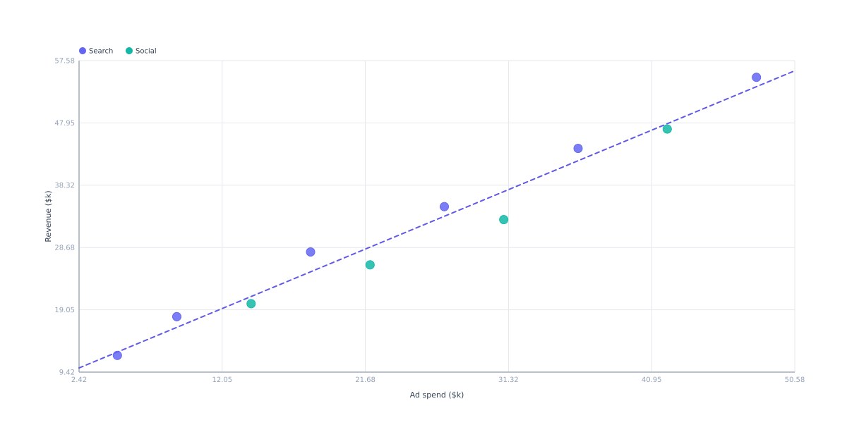
Some questions only a scatter answers: do these two numbers move together, where are the clusters, which point is the outlier. The Scatter component draws it from a flat list of pairs, no charting library in the loop.
The dataThe data
One object per point: { x, y }, with an optional r, label, color, and category. The x and y place the dot on the two axes, and the axes rescale to fit whatever range you send. Add a category and points in the same group share a color, with a legend built for you. Add an r and the dot grows into a bubble, so a third value rides along in the size.
Trend and styleTrend and style
Turn on showTrend and the chart draws a least-squares line through the points, so a correlation reads at a glance. A per-point color overrides its category color; caption the axes with xLabel and yLabel, or pin the range with xMin/xMax/yMin/yMax instead of auto-fitting. Points, grid, and legend all scale to the box.
Dynamic data per renderDynamic data, per render
POST https://render.imejis.io/v1/<design-id>
{ "scatter.data": [
  { "x": 5,  "y": 12, "category": "Search" },
  { "x": 18, "y": 28, "category": "Search" },
  { "x": 22, "y": 26, "category": "Social" },
  { "x": 48, "y": 55, "category": "Social" }
] }
Point an image at the render URL and a correlation chart in a weekly report or a shared dashboard stays current on its own as you push fresh points.
Try itTry it
It's under Data in the editor palette, with a live playground on the scatter component page, or start from the free scatter plot maker.