
New Component - Radar / Spider Charts
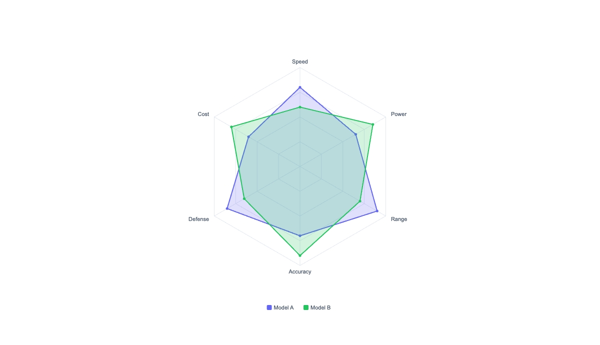

New component radarNew Component: Radar
When you're comparing things across several dimensions at once, product vs product, player vs player, you vs the benchmark, a radar chart says it in one shape.
The dataThe data
It takes two arrays: axes (the spoke labels) and series, where each series is { name, values, color? } and its values line up with the axes in order. Overlay two or three series and each draws its own colored polygon with a legend, which is perfect for "us vs competitor vs benchmark."
ControlsControls
Set a fixed max to keep charts comparable across renders, or leave it off to auto-fit each chart to its own data. You also get adjustable grid rings, fill opacity, per-series colors, and optional value labels on the vertices for single-series scorecards.
Dynamic data per renderDynamic data, per render
POST https://render.imejis.io/v1/<design-id>
{
  "compare.axes": ["Speed", "Power", "Range", "Accuracy", "Defense"],
  "compare.series": [
    { "name": "Model A", "values": [80, 65, 90, 70, 85] },
    { "name": "Model B", "values": [60, 85, 70, 90, 65] }
  ]
}
Product and feature comparison scorecards, team and player skill profiles, candidate or vendor evaluations, performance-vs-benchmark cards.
Try itTry it
It's under Data in the editor palette, with a live playground on the radar component page.