
New Components - Progress Bars, Rings, Gauges & Ratings
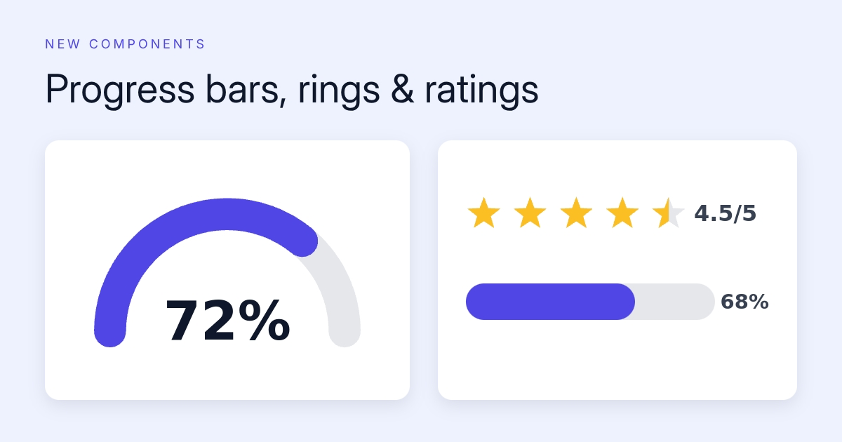

New components progress bars rings gauges ratingsNew Components: Progress Bars, Rings, Gauges & Ratings
Two more components joined the palette, both built for one job: turning a number into something you understand at a glance.
The progress componentThe progress component
One component, three shapes. A linear bar (horizontal or vertical), a circular ring with the value in the center, or a half-circle gauge for that speedometer look. The label can show a percent (72%), the raw value, or a fraction (72/100), and max defaults to 100 so plain values read as percentages out of the box.
Colors, thickness, and rounded ends are all yours to set. Goal trackers, capacity meters, course completion cards, fundraiser thermometers.
The rating componentThe rating component
A row of icons filled to a value. Stars by default, but hearts, circles, any emoji, or your own SVG path work too. Fractional values fill the last icon exactly, by halves, or rounded, so a 4.5-star review actually looks like 4.5 stars.
A few details we're glad we got right:
- Not limited to 5. A ten-point scale with an "8.6/10" label works fine, and so does a "7 of 10" tally.
- Optional numeric label in decimal (4.5), fraction (4.5/5), or count (4 of 5) form.
- Grid wrapping with
perRow, for when 20 icons shouldn't sit in one line.
Dynamic of courseDynamic, of course
Both components take a live value per render. Pass "score": 4.5 or "goal.value": 68 to the render endpoint and the image updates. One review-card template can render every product in your catalog with its real rating.
Play with them on the progress and rating component pages, live previews and copyable API requests included.