
Stat Tiles Now Do Sparklines

Update sparkline stat tilesUpdate: Sparkline stat tiles
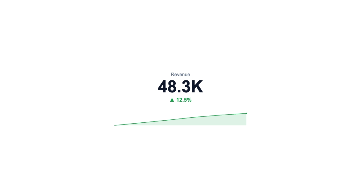
The metric component already rendered a big number, a label, and an up/down delta. Now it can carry a trend too. Add a sparkline array and a mini line chart draws in a strip at the bottom of the tile, the ticker look you'd put on a watchlist or a live dashboard.
It colors and captions itselfIt colors and captions itself
The line auto-colors red or green by direction, and it respects deltaDirection. So a falling churn metric reads green, not red. Here's the part I like: if you don't set an explicit delta, the tile works out the percentage move from the series' first-to-last change and shows it above the line. One array in, a complete ticker out.
Dynamic data per renderDynamic data, per render
sparkline is an overridable field, so a watchlist tile updates its whole trend on every call:
POST https://render.imejis.io/v1/<design-id>
{ "mrr.value": 48200, "mrr.sparkline": [41000, 42500, 45200, 46900, 48200] }
Stock and crypto watchlist tiles, live KPI tickers for status dashboards, weekly-trend cards for Slack.
Try itTry it
It's the "Ticker" variant on the metric component page, with a live playground and the exact API request.