
New Component - Choropleth Maps
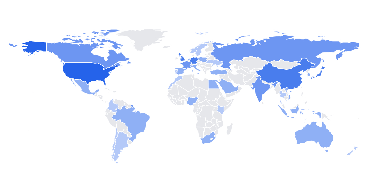

New component mapNew Component: Map
A lot of dashboards end with the same question: where. Where are the users, where did sales land, where is growth happening. A choropleth answers it in one picture, and now you can render one from a flat list of values.
The dataThe data
It's a list of regions: { id, value }. The id is the join key. For the world basemap that's an ISO-3166 code ("US", "FRA") or a country name; common names and abbreviations like "Russia", "UK" and "UAE" resolve too. Regions with no row render in emptyColor, so a partial dataset just leaves the rest neutral. You bring values, the map handles the shapes.
Pick a basemapPick a basemap
basemap: "world" covers every country. basemap: "us-states" covers all 50 states plus DC, keyed by postal code ("CA"), ISO-3166-2 ("US-CA") or state name. The US map is drawn in Albers-USA with Alaska and Hawaii tucked in as insets, so it looks right without any setup. Province and state basemaps for Canada, Germany, Australia, Brazil and India followed soon after.
Two color modesTwo color modes
colorMode: "ramp" shades by intensity in a single hue, good for totals like sales or users. colorMode: "diverging" colors positive and negative values apart from a neutral middle, built for growth, change and vote-margin maps. Set colors for an exact ramp or baseColor for a single hue, and the legend shows the real value range.
Dynamic data per renderDynamic data, per render
POST https://render.imejis.io/v1/<design-id>
{ "map.data": [
  { "id": "US", "value": 920 },
  { "id": "DE", "value": 700 },
  { "id": "IN", "value": 480 }
] }
Sales and users by country for dashboards, coverage maps for where a product ships, and diverging growth or election maps by state.
Try itTry it
It's under Data in the editor palette, with a live playground on the map component page.