
New Component - Dumbbell / Range Plots
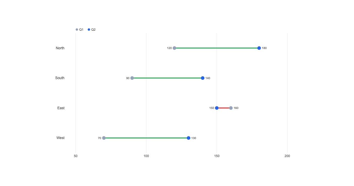

New component dumbbellNew Component: Dumbbell
When you want to show change between two points, last quarter vs this quarter, min vs max, before vs after, a grouped bar chart is overkill and a line chart is noise. The dumbbell component nails it. One row per category, two dots, and a bar connecting them.
The dataThe data
Each row is { label, from, to }. The two dots mark the start and end value, and the bar between them shows the gap at a glance. Turn on colorByDirection and increases tint green while decreases tint red, so the story reads before anyone reads a number.
StylingStyling
You get independent colors for the "from" and "to" dots, an optional fromLabel/toLabel legend, value labels, and a compact/number/currency value format. The margins auto-reserve space so long value labels don't clip at the axis extremes.
Dynamic data per renderDynamic data, per render
POST https://render.imejis.io/v1/<design-id>
{ "salaries.data": [
  { "label": "Junior", "from": 60000, "to": 72000 },
  { "label": "Senior", "from": 120000, "to": 145000 }
] }
Salary-band cards, YoY regional comparisons, Q1 to Q2 metric shifts, before/after benchmarks. One template, fresh rows each render.
Try itTry it
It's under Data in the editor palette, with a live playground on the dumbbell component page.