
Explore the New Component Library
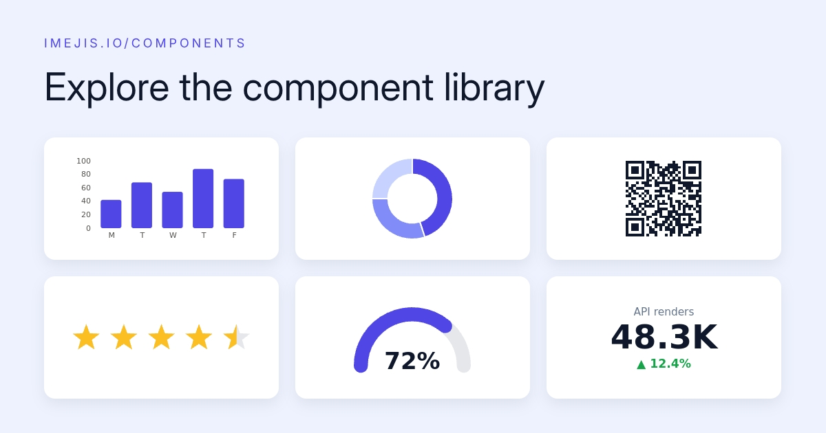

Explore the new component libraryExplore the New Component Library
Every component in Imejis.io now has its own home on the web: imejis.io/components. All 27 component types, over 75 ready-made styles, and every property documented. But the part we're most proud of isn't the documentation. It's that the docs are alive.
A playground not screenshotsA playground, not screenshots
Each component page embeds the same property panels the real editor uses. The chart page has the actual chart data grid. The rating page has the actual emoji picker. Change anything and two things update instantly: a live preview of the component, and the exact API request that would reproduce your edits.
That last bit changes how you learn the API. Instead of reading about valueFormat and guessing, you click through the options, watch the preview, and copy a request that already contains your choices. The design JSON is right there too.
Ready made stylesReady-made styles
Every component ships with named styles: the donut pie, the gauge progress, the ten-point rating, the dark-header table, and so on. Each style has its own page with a seeded playground, real-world examples, and its own API example. If you've seen a look you want, chances are it's one click from a working request.
The rest of itThe rest of it
- A property reference table per component: every property, its type, default, and what control edits it in the editor.
- Use cases and example galleries showing the default look in real designs.
- FAQ sections with the questions we actually get.
- Cross-links into the editor, so "I want this one" is a single click.
The library is generated from the same component registry that powers the editor and the API. When a component gains a property, the docs update with it. No drift, ever.
Start anywhere: charts, QR codes, text, or the full index.