
New Components - Bar, Line, Area & Pie Charts
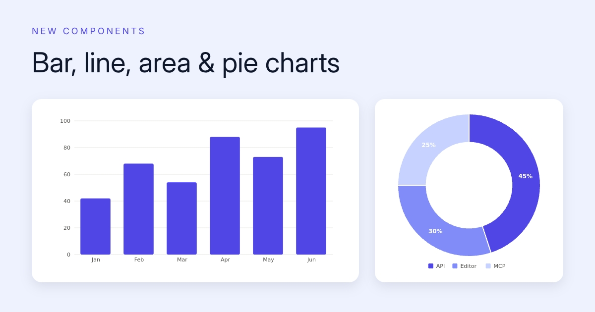

New components bar line area pie chartsNew Components: Bar, Line, Area & Pie Charts
Charts used to be the thing you screenshotted from a dashboard and pasted into a design. Not anymore. Two new components render charts directly inside your images, and you can feed them fresh numbers on every API call.
The chart componentThe chart component
Bar, line, and area charts with single- or multi-series data. Six ready-made styles: line, area, horizontal bars, stacked series, sparkline, and multi-line. You control labels, legends, axes, grid lines, and per-series colors. Values can format as plain numbers, compact (1.2K), percentages, or currency.
The sparkline style deserves a call-out: it strips the axes and grid for a clean inline trend, the kind you'd put next to a KPI number on a stats card.
The pie componentThe pie component
Pie and donut charts from a single data series, with slice labels as percentages or raw values and an optional legend. The donut hole size is adjustable, which leaves room for a centered metric.
Dynamic data per renderDynamic data, per render
This is the part that matters for automation. Mark the component dynamic and every render can carry new data:
POST https://render.imejis.io/v1/<design-id>
{ "sales_chart.data": [42, 68, 54, 88], "sales_chart.labels": ["Q1", "Q2", "Q3", "Q4"] }
Weekly report cards, portfolio performance images, poll results for social, all from one template and a JSON body. Multi-series works the same way through series.
Try themTry them
Both are in the editor palette under Data, and the chart and pie chart pages have live playgrounds where you can poke at every property and copy the exact API request that reproduces your edits.