
New Component - Bullet Charts (Actual vs Target)

New component bulletNew Component: Bullet
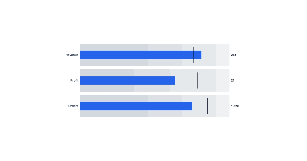
Gauges look nice but waste space. The bullet chart is the analyst's answer: one tight row per KPI that shows the value, the target, and how good that value is, all in a strip.
The dataThe data
Each row is { label, value, target, ranges }:
valuedraws the measure bar.targetdraws a vertical tick to beat.rangesare ascending thresholds (say[150, 225, 300]) that split the track into graded qualitative bands: poor, satisfactory, good.
Scale is per-row max/ranges with global fallbacks, or it auto-fits to the largest value in the row. Set a shared max across rows (like 100 for percent-to-goal) and every target tick lines up, so you can compare rows at a glance.
Dynamic data per renderDynamic data, per render
POST https://render.imejis.io/v1/<design-id>
{ "kpis.data": [
  { "label": "Revenue", "value": 268, "target": 250, "ranges": [150, 225, 300] },
  { "label": "Profit",  "value": 21,  "target": 26,  "ranges": [12, 20, 30] }
] }
Exec KPI scorecards, budget-vs-actual for finance digests, quota attainment for sales, SLA-vs-goal for status reports.
Try itTry it
It's under Data in the editor palette, with a live playground on the bullet component page.