Fancy Text on Images, Not Just in Bios

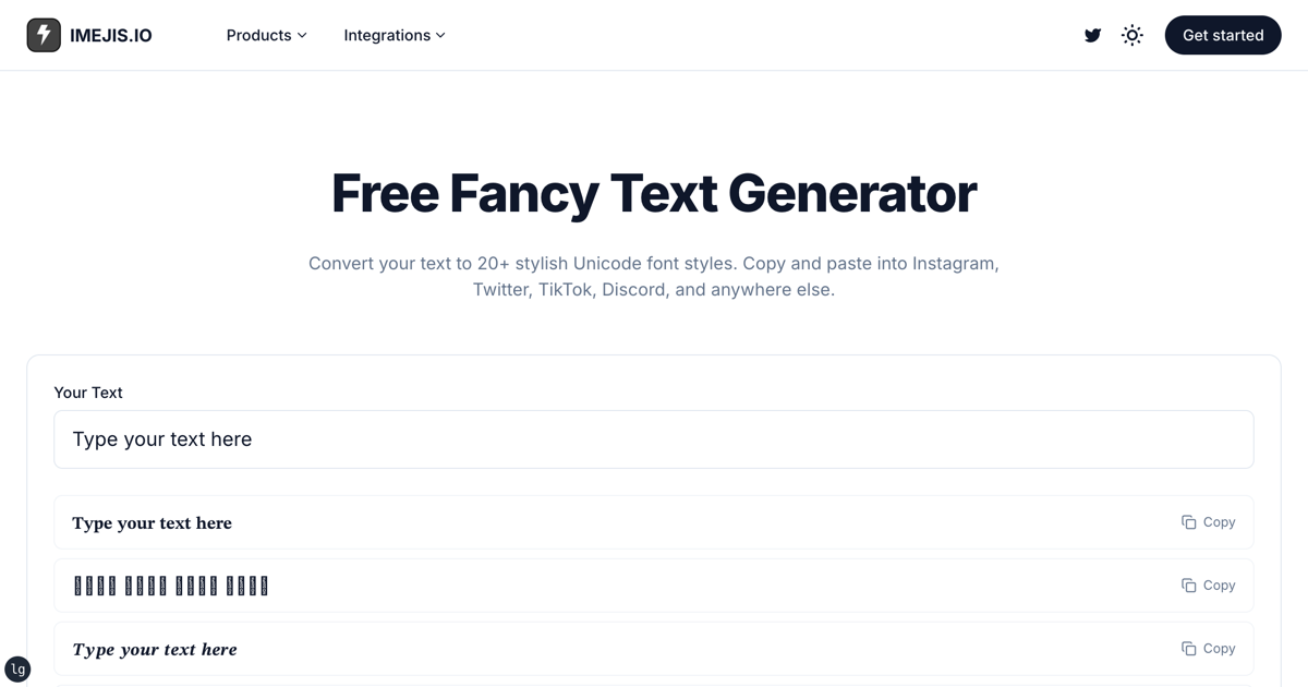
A fancy text generator does not make your letters bold. It replaces them with different characters that happen to look bold. That distinction sounds academic until a recruiter's search misses your headline, or a screen reader reads your name out one symbol at a time.
This is what those generators actually produce, and when to stop using them.
What a fancy text generator really returnsWhat a fancy text generator really returns
Take the Bold style in the fancy text generator and feed it
Hire Me. You get back:
𝐇𝐢𝐫𝐞 𝐌𝐞That looks like seven characters plus a space. It isn't. Running it through JavaScript:
"𝐇𝐢𝐫𝐞 𝐌𝐞".length        // 13
"Hire Me".length           // 7

[..."𝐇𝐢𝐫𝐞 𝐌𝐞"][0].codePointAt(0).toString(16)   // "1d407"
That first character is U+1D407, MATHEMATICAL BOLD CAPITAL H, from the
Mathematical Alphanumeric Symbols block. It is a different
character from H, in the same way 5 and V are different characters. It was
added so mathematicians could write bold variables in plain text, not so anyone
could style a bio.
Two consequences follow immediately:
"𝐇𝐢𝐫𝐞 𝐌𝐞".toUpperCase()   // unchanged, there is no uppercase mapping
"𝐇𝐢𝐫𝐞 𝐌𝐞".includes("Hire") // false
A search for your own name will not match it.
Why the same string looks different on other peoples screensWhy the same string looks different on other people's screens
Each code point needs a glyph in whatever font the reader's device uses. The common blocks are everywhere. The decorative ones are not.
When a font has no glyph, you get the replacement box. This is the single most common complaint about fancy text, and it is not the reader's fault or a bug in the generator. The character simply does not exist in their font.
The generator catalog here spans 75 styles in seven groups: Fonts, Bubbles, Lines, Glitch, Size, Look-alikes and Codes. The further a group sits from plain letters, the thinner the font coverage gets.
Some styles cannot be undoneSome styles cannot be undone
A useful test for how lossy a style is: convert text into it, then try to convert it back.
Running every style in the catalog through that round trip with the probe
Hire Me 2026, 49 of the 75 styles come back exactly. 26 do not. The ones
that fail include:
Filled circles   🅗🅘🅡🅔 🅜🅔 2026
Squared          🄷🄸🅁🄴 🄼🄴 2026
Flag letters     🇭🇮🇷🇪 🇲🇪 2026
Small caps       ʜɪʀᴇ ᴍᴇ 2026
Superscript      ʰⁱʳᵉ ᵐᵉ ²⁰²⁶
Small caps is the one that surprises people. It looks like a typographic feature, but there's no small-caps capital in Unicode, so the style borrows letters from the phonetic alphabet. Convert back and the capitals are gone.
This is why the generator ships a remove-formatting step at all. It's also why you should keep the original text somewhere before styling it.
Where fancy text is fineWhere fancy text is fine
It isn't useless. In a bio, a comment or a display name, where the text is read by humans on a screen and nothing downstream has to parse it, it does the job and costs nothing.
Stop at the point where a machine has to read the words:
- Page titles and headings. A search engine indexes the characters it sees.
- Anything someone will search, sort or filter. Names and SKUs especially.
- Alt text and link text. This is what a screen reader announces.
- Anything you will need back as plain text later.
What to use instead for a post imageWhat to use instead for a post image
If the reason you wanted styled text was that the words should look like something, render them as an image with a real typeface. The type is then genuine font rendering at any weight, and the words still exist as alt text for anything that needs to read them.
A design with the text marked as a dynamic field becomes a render URL:
https://render.imejis.io/v1/<designId>POST the words you want, with your API key in the dma-api-key header:
{
  "headline.text": "Fancy text is symbols. This is a typeface.",
  "handle.text": "@imejis"
}
The example above renders at 1080x1080 in Playfair Display 700. Swap
fontFamily for any family in the catalog, or upload your own. Because it is
real font rendering, the usual typographic controls apply: weight, letter
spacing, line height, and an auto-fit range so a long headline shrinks instead
of overflowing.
For a one-off, the text on image tool does the same thing without an API key.
The short versionThe short version
Fancy text generators are a character-substitution trick. That's fine in a bio and wrong everywhere a machine reads the words. When you want the words to look designed and stay readable by software, set them in a real typeface and render an image.
The text component reference lists the properties you can override per render, and the API docs cover authentication and output formats. Render allowances are on the pricing page.