Back to changelog
Pre-Built Text Style Components
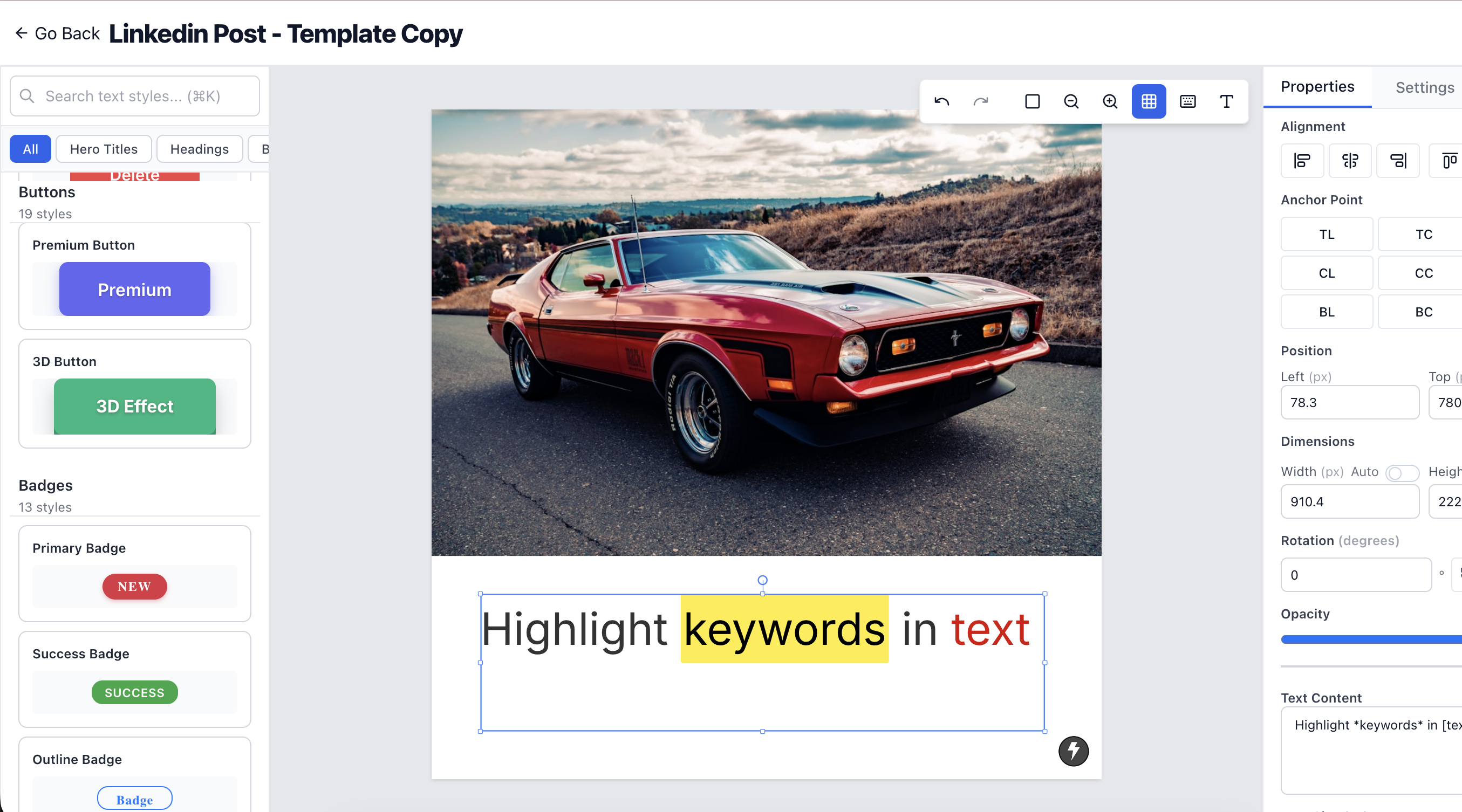

Pre-built text style components - click and apply
Skip the font-size-and-spacing fiddling. The text styles panel in the left sidebar holds a curated set of production-ready typography. Select a text component, click a style, and it's applied.
What's in the panel
Four categories cover the usual jobs: hero titles for headlines, headings for sections and subheads, body text for readable copy, and button styles for CTAs (primary, secondary, warning, info, and ghost). Each style carries its own sizing, spacing, and color, so the hierarchy and contrast are handled for you.
Open the panel, pick a text component, and apply. It also makes a quick starting point on anything in the template library.